Here is the original:

And here is the newly done one:
Tell Me what you think. For example 7/10

Member
Posted 10 November 2006 - 07:22 PM

Member

Posted 10 November 2006 - 07:28 PM
Member
Posted 10 November 2006 - 07:53 PM
That's pretty nice...I'd give it an 8/10. Good Work!

Velcro'd Beanpole

Posted 10 November 2006 - 09:02 PM
Member
Posted 10 November 2006 - 09:07 PM
It looks really cool.
HOWEVER, all you did was invert the colors, so I don't think I can really give you a rating for something that took so little effort. I just did it in about eight seconds (from the moment I saved the first picture).
Still, it looks cool.
Member

Posted 11 November 2006 - 12:52 PM
Fear the Robble...

Posted 11 November 2006 - 01:18 PM
Certified Badass

Posted 11 November 2006 - 07:23 PM
"Too close for missiles, I'm switchin' to guns"
Member

Posted 12 November 2006 - 05:29 PM
Member

Posted 12 November 2006 - 06:08 PM
Member

Posted 12 November 2006 - 07:49 PM
Member

Posted 12 November 2006 - 09:28 PM
Member
Posted 12 November 2006 - 11:46 PM
Member

Posted 13 November 2006 - 05:40 AM
Member
Posted 14 November 2006 - 07:09 PM
Same old, same old.
5/10.
)


Edited by Substance Abuse, 14 November 2006 - 07:10 PM.
Fear the Robble...
Posted 14 November 2006 - 07:31 PM
Member

Posted 14 November 2006 - 09:49 PM

Member
Posted 14 November 2006 - 11:03 PM
Member

Posted 15 November 2006 - 01:57 AM
Lancaster that is very cool. How much does a program like that go for?

Edited by Meaker VI, 15 November 2006 - 02:17 AM.
Member
Posted 15 November 2006 - 06:43 AM
Member

Posted 15 November 2006 - 03:49 PM
Same old, same old.
5/10.
I just started doing comp-art a couple months ago. This is one of my first creations.
Here are a couple animateds I did while I was in school: (P.S They are pretty stupid and I made them to impress the girls
^ I simply animated the original parental advisory sign to blink red.


Edited by NerfMonkey, 15 November 2006 - 03:54 PM.
Member

Posted 15 November 2006 - 03:55 PM
Edited by Pvt.McFlurry, 15 November 2006 - 03:58 PM.
Member
Posted 15 November 2006 - 07:28 PM
Edited by Substance Abuse, 15 November 2006 - 07:37 PM.
Member

Posted 15 November 2006 - 09:19 PM
Member

Posted 16 November 2006 - 01:04 AM
I'd give it a 6/10.
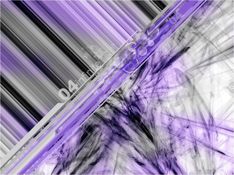
In my opinion, the placement of the diagonal lines takes away from the interesting group of 3-d images you have below them. It's kind of cutting the image in half. I'd like to see more of the 3-d stuff, and less of the stripes above the diagonals. Simply put, I think if you move the diagonals up towards the top left corner some more to show off some of the 3-d stuff, it might be a little more interesting. Just my two cents.
Edited by Drano, 16 November 2006 - 01:11 AM.
0 members, 1 guests, 0 anonymous users